What changed
Android Developers Blog published new guidance on July 22, 2026 for Android teams preparing their apps for Samsung's latest Galaxy foldables and wearables. The post follows Samsung's Galaxy Unpacked event, where the company introduced the eighth-generation Galaxy Z series, including Galaxy Z Fold8 Ultra, Galaxy Z Fold8, and Galaxy Z Flip8.
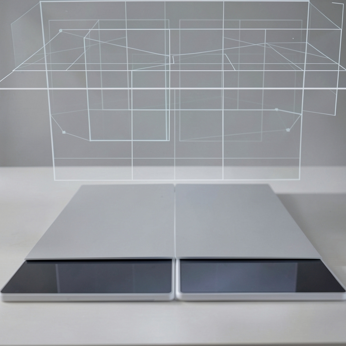
The important shift is not just another hardware refresh. Google says devices such as Galaxy Z Fold8 add more display shapes, natural orientations, and device postures that Android apps need to handle. Samsung's own newsroom describes Galaxy Z Fold8 as using new display proportions, with a 5.5-inch cover screen and a 7.6-inch main display that can present 4:3, 3:4, and 10:16 experiences depending on how the device is used.
For developers, that makes fixed portrait assumptions increasingly fragile. An app that looks acceptable on a conventional phone can become cramped, letterboxed, awkwardly stretched, or poorly arranged when a user unfolds a device, enters split screen, rotates content, or moves between an outer and inner display.
Why it matters
Google's message is practical: Android apps should be designed around the actual window available to the app, not around a single imagined phone screen. The company's broader adaptive apps guidance says apps should work across window sizes, aspect ratios, orientations, and postures while preserving continuity as users move between form factors.
That matters because foldables are no longer only about a larger panel. A fold can create a natural divider. Multi-window mode can reduce the usable app area. A landscape-first main display can challenge screens that were designed as tall portrait stacks. External inputs such as keyboard, mouse, trackpad, stylus, and accessibility tools also become more relevant when phone, tablet, desktop, and wearable patterns overlap.
The developer takeaway is straightforward: responsive design on Android is becoming a core product-quality issue, not a polish task reserved for tablet screens.
What Google recommends
Google's post points developers toward fluid adaptive layouts, Window Size Classes, Jetpack WindowManager, Jetpack Compose layout tools, fold-aware UI behavior, CameraX, and state retention with ViewModel.
The layout guidance starts with avoiding hardcoded orientation and size rules. Google recommends using width as the first signal for layout changes, then adjusting for height, while relying on flexible containers that can wrap, span, and reflow content. In the April 2026 Jetpack Compose release, Google highlights Grid, FlexBox, and MediaQuery APIs as tools for handling dynamic tracks, multi-axis alignment, and environment-aware UI decisions.
Jetpack WindowManager is the bridge between visual design and device posture. Google's foldable codelab explains that foldables can expose display features such as hinges and folds, and that apps can use WindowManager information to avoid placing important content where it may be hidden or visually split.
Camera apps get a specific warning. Moving from a compact outer display to a larger inner display can change layout aspect ratios even when device rotation does not change. Google says CameraX PreviewView can handle sensor orientation, rotation, and scaling, while CameraViewfinder can help Camera2 codebases adapt without a full rewrite.
Wearables are also part of the update. Google says Wear OS 7 introduces Wear Widgets built with Jetpack Glance and RemoteCompose, giving developers another small-screen surface for quick, glanceable interactions. The post also says Samsung's new foldables include Gemini Nano 4 on device and points developers to Android's intelligence-system experiments and ML Kit Prompt API.
What teams should do next
Teams shipping Android apps should audit the screens most likely to break first: onboarding, checkout, camera capture, media editing, maps, document views, dashboards, chat surfaces, and any UI with dense controls. The risk is highest where layouts assume portrait dimensions, preserve little state across configuration changes, or ignore multi-window and hinge positions.
Android's adaptive app quality guidelines give teams a useful progression. Basic readiness means the app can run without letterboxing or compatibility mode and critical flows still work. A stronger implementation optimizes layouts across screen sizes and device configurations. The top tier adds differentiated experiences for foldables and large screens, including multitasking, foldable postures, drag and drop, and stylus input where appropriate.
This is analysis, not a guarantee that every app must redesign immediately. But Google's July 22 post makes the direction clear: the Android ecosystem is adding more screens, more postures, and more interaction surfaces, and apps that calculate their real window and adapt deliberately will age better than apps built around one fixed phone canvas.
Related Articles
Evos puts human approval at the boundary of its industrial AI operators
The startup announced $9 million for operators that learn business tasks. Its staged-autonomy model makes permissions and escalation central to evaluation.
SAP's TechWolf deal brings inferred skills into the SuccessFactors roadmap
SAP has agreed to acquire TechWolf, with closing expected in Q4. Its skills-mapping approach could help workforce planning, but employee review and evidence of proficiency remain essential.
Safari 27's Trade Desk ad-blocking report moves to iOS 27.2 beta testing
The public WebKit thread records changes in an October 5 beta, but no completed test report. Publishers need to separate ad delivery from identity matching.
RemoveMacAI 1.0.1 clarifies which Mac cleanup actions delete immediately
The new native app goes beyond disabling Apple Intelligence. Its latest patch distinguishes immediate deletion and reports only measured model space.